Bikeshare Visualization
When you need a bike from the Bay Area Bike Share, will there be one available? How effectively are bike share stations handling user demand throughout the day?
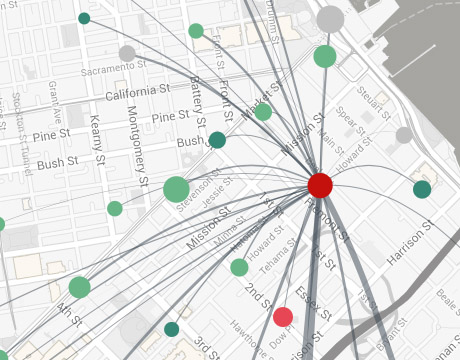
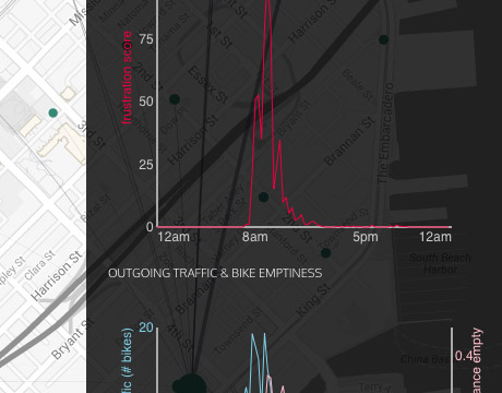
Our team took Bay Area Bike Share data from August 2013 through Feburary 2014 and visualized the outgoing bike traffic from each bike share station. We also created a measure we called a "frustration score" and visualized it an average day -- this combines the chance that a station is without available bikes with the traffic through that station.
HTML, CSS, JavaScript, d3.js, jQuery, Python
Visualizing Bikes

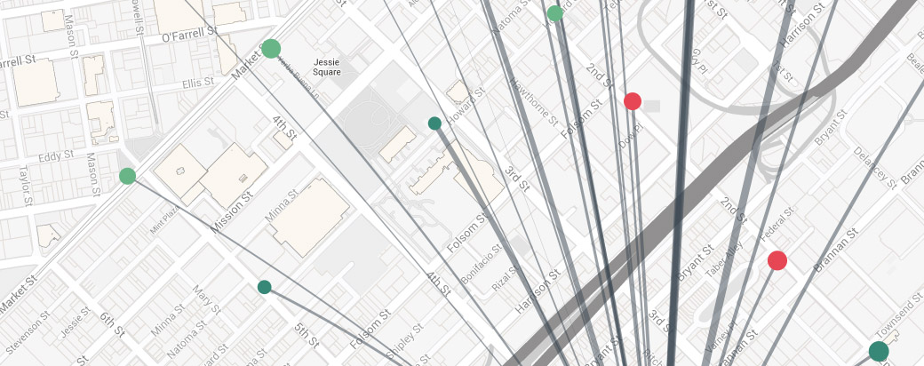
Stations are plotted on the map according to their outgoing traffic throughput (size) and their average daily frustration score (color). The thicknesses of the lines indicate the amount of traffic going to each other station. These lines and dots are adjusted as times are selected using the time slider control.

Our "frustration score" combines the chance a station has no available bikes with the level of traffic through that station. This is based on the idea that it is frustrating when a station has no bikes available, but even more so when this happens at a busy location at a transit hub.
